Thursday, February 3, 2011
Monday, April 20, 2009
Final Drawing Project!
So here it is: My final drawing project! Bring 'Em Back Alive or A Magnum Rock Opus.
 Bring 'Em Back Alive or A Magnum Rock Opus, 78 x 50", ink on paper, 2009.
For this project, I was interested in the idea of translating an idea from another medium into drawing. A classmate of mine had previously done it with the poem Kubla Kahn, so I figured that literature was out, since it had been done already. Naturally, I moved to music.
I chose Audioslave's Bring 'Em Back Alive because that song has ALWAYS made me think of an epic situation (although I'm saving that one for something else!) and I liked the allusions to the story of Icarus in the lyrics. I modified the story slightly, going along with the lyrics - instead of falling into the ocean, Icarus falls into a crowd and they bury him alive.
I was thinking of the old, old, OLD wall drawings and paintings we studied in art history, where an entire narrative (or large chunk) would be handled in a single panel. Kind of Surreal, with the playing of space. So I looked at the anticipation of flight to the fall.
Part of what I liked about this was that it reflected my views on society: it's a few who dare to step out and try, but if you fail there's never a shortage of people who criticize you for it. I avoided the whole allusion of Icarus being a model for the artist because that's WAY too overdone. Artists tend to evangelize themselves way too often for my liking.
Saturday, March 28, 2009
Final Photography Project!
So, here are the images! They're presented here in the same order I presented them for crit, only in a vertical order due to the blog. I call this series Urban Arithmetic. I was looking at the additions and subtractions created in urban spaces, additions and subtractions that seemed like they didn't belong.
 Urban Arithmetic Series, digital print, 11x16", 2009
Like here. While many focus on the tree in the arch-way, for me the photo is about the space above it, where it looks like a chunk of the wall has just been torn out of the building and nothing is being done about it. I also like the implied sense of human presence created by the junk on the ground and the crossing barrier. I think the photo is more powerful by having human objects but no people.
 Urban Arithmetic Series, digital print, 11x16", 2009
The same can be said of this photograph. The focus seems to be on the end of the alleyway, but for me it's all about the emergency stairs and AC units that look like they were just slapped on the walls. It's almost like retrofitting. I like how the graffiti shows that someone was there, but isn't anymore. The grimy colors play off of the green of the AC units. These two images were presented vertically and made taller in order to play off of the verticallity of the two scenes I was shooting.
 Urban Arithmetic Series, digital print, 11x14", 2009
 Urban Arithmetic Series, digital print, 11x14", 2009
 Urban Arithmetic Series, digital print, 14x11", 2009
 Urban Arithmetic Series, digital print, 14x11", 2009
Final one! I liked the small light at the back of the building from the windows. Kind of like the light at the end of the tunnel, but what's waiting before? That's played up by the pylons and the mesh fence.
Ultimately, I like this project because I'm going to keep going with it. I've set up constraints in such a way that my subject matter is focused while still allowing me to roam all over the city. Summer should make it easier to do, since the weather won't be the misery that is Spring in London. As a study of urban growth and development, it's something that I'm interested in (but not in an arty-farty way, I just like thinking about how people interact and how the surroundings reflect that.... but again, not arty!).
Still waiting on my mark for this one. But the Prof liked it, so hopes are high!
Like here. While many focus on the tree in the arch-way, for me the photo is about the space above it, where it looks like a chunk of the wall has just been torn out of the building and nothing is being done about it. I also like the implied sense of human presence created by the junk on the ground and the crossing barrier. I think the photo is more powerful by having human objects but no people.
The same can be said of this photograph. The focus seems to be on the end of the alleyway, but for me it's all about the emergency stairs and AC units that look like they were just slapped on the walls. It's almost like retrofitting. I like how the graffiti shows that someone was there, but isn't anymore. The grimy colors play off of the green of the AC units. These two images were presented vertically and made taller in order to play off of the verticallity of the two scenes I was shooting.
I really like the duality created in this photo. The hue is so warm and soft, but the focus is entirely on the dark doorway at the center of the image. It seems so foreboding! The focus for me was the doorway in this image, but the garbage and the signage and all that other junk floating around just enhanced it. It all seemed to be protruding into the space. I love the flattened pop bottles laying around the mud. Seems ominous!
I love the winding stairs in the photo, and they're the focus for me. The brickwork is so old and worn, with graffiti all over it, but here are these pristine looking wooden stairs! They look like they grew over the building, it's fantastic. Had to touch up the sky in this photo because it was getting late and the sky was pretty much blah white. However, I like how it turned out after burning the sky and leaving the rest of the image (virtually) the same. The stairs look punchier with the additional contrast.
I've always found this little Asian dry-cleaners interesting. I liked the winding stairs, again, but it was mainly the fact that it looks like it just sprung up in between these two bigger buildings! It just doesn't look natural! That's why I shot from a low angle, to emphasize the size and depth of the buildings sandwiching it. I had to wait FOREVER for people to stop fiddling with their cars. It was annoying... Again, had to mess with the sky so that the buildings weren't engulfed by the shadows.
Final one! I liked the small light at the back of the building from the windows. Kind of like the light at the end of the tunnel, but what's waiting before? That's played up by the pylons and the mesh fence.
Ultimately, I like this project because I'm going to keep going with it. I've set up constraints in such a way that my subject matter is focused while still allowing me to roam all over the city. Summer should make it easier to do, since the weather won't be the misery that is Spring in London. As a study of urban growth and development, it's something that I'm interested in (but not in an arty-farty way, I just like thinking about how people interact and how the surroundings reflect that.... but again, not arty!).
Still waiting on my mark for this one. But the Prof liked it, so hopes are high!
Thursday, March 19, 2009
Superheroes in the Gallery
Quang is always bugging me how I don't really link to any artists on here. This is despite the fact that I have a personal bookmark list of artists I follow that could constitute a whole separate internet. So, today it's a bit of a two in one! Booooom! and a video on Aaron Noble.
I love Boooom! because they have a wide variety of artists doing different things, and it's always great to kinda get a chance to step back and take a look at artistic developments from a distance, rather than sifting through at the ground level trying to find a new tendency to explore.
 Rainbow 6: Ground Boss, 22x30", gouache on watercolor paper
Aaron Noble, 2007
Aaron Noble is an artist my professor told me to look into last semester for my final drawing project, Pulp Fiction, in relation to the fact that I was looking at pop culture material and abstracting it. I see a lot of similarities in what I did with what he's doing, only he's way better at it, haha. Suffice it to say, I'm mad jealous of this guy. If I could be doing what he's doing, I would be so stoked. Ergo... I can't wait 'til summer so I can get down to a practice regime!
I love Boooom! because they have a wide variety of artists doing different things, and it's always great to kinda get a chance to step back and take a look at artistic developments from a distance, rather than sifting through at the ground level trying to find a new tendency to explore.
 Rainbow 6: Ground Boss, 22x30", gouache on watercolor paper
Aaron Noble, 2007
Saturday, March 7, 2009
Fashion + Figure Ground?
For my Figure/Ground assignment, we were supposed to establish some sort of relationship between the figure in the photograph and the environment that we were in. So... I went with that as the basic idea, naturally, and tried to find little bits and pieces that meshed together to create a strong photograph. Also, I didn't approach this project as a series, but rather produced each image as if it were to stand on its own. In that regard, I believe I succeeded.
Ultimately, I wanted to take a more personal approach to these photos. I worked with my subjects to find areas that they thought were interesting or related to them (although I would steer them away from crappy or cliched areas, like Starbucks). Then I'd have them move around until I thought I found an angle or framework that was visually interesting, and started shooting from there. I'd be looking to match colors, play on scale, work with linear elements, etc. I ended up with photos that look somewhat staged, but are the product of pure improvisation.
 Reach for the Sky, digital print, 11x16", 2009
I really liked this photo because of how Surreal it looks. The cloud cover allowed for some interesting atmospheric haze. I like the angle of the dead tree and its branches/trunks, and how the subject is both pushing against them and being constrained by them while looking like its all so effortless. It's also an interesting play between age and vitality, with the subject being a young, hip-looking male vs. the tree which is dead and decaying. Finally, I thought the colors really matched with the clothes. The sky played off of his jeans, while his jacket worked well with the natural surroundings.
 Waiting..., digital print, 11x16", 2009
This is probably my favorite photo of the bunch. Kind of ironic, since it started with me directing the subject where to go based on my view of his personality. We ended up downtown at One London Place, and it was really uninspiring. So we started walking around, and he suggested a bus shelter beside the building - and it was fantastic. I love the vibrant blues, the diagonal lines, and the translucency of the glass. The strong shadows and utilitarian bench work great with the angles created by the pose of his legs as well as the linear designs on the glass. I like how his legs are so large with the angle of the shot, as well. He's a pretty tall guy, and I think that's one of the stronger aspects of this photograph. Finally, I thought his clothing worked well with the bus shelter environment. He looked like he belonged, but the clothes were crisp enough to make him seem out of place.
 Escaping, digital print, 16X11", 2009
Let it never be said I don't suffer for my art. I literally stepped in shit taking this photograph, and my subject here complained a lot about the smell. Another story goes along with this photo: My friend is something of a pyro, so we were going to build a giant bonfire to take a photo of him with. However, nature had other plans since it had just rained, and everything was soaking wet. So, we found his friend's garage to be pretty interesting with all of the clutter. The frantic clutter seems to mesh with the personality displayed at first glance. The flame of the lighter is that hint of pyromania - of freedom - and the substance behind the flame the escape from the clutter. I really liked how the window created a sense of divided space - why is he in this dingy environment? What keeps him in here when the outside is so close behind him?
 Big Man, digital print, 11x16", 2009
Another nature photo. At first I was attracted to the varying patterns of the nature 'path' we were on, and how he seemed to blend into his environment with his clothing. It was all pretty boring, in retrospect. So, with about 5 minutes to spare, we tried to work with the ledge hanging over the river and the results speak for themselves. We started playing with his proximity with the ledge and the angle of the shot to create a slight telephoto effect so that it looks like he's about to step into the water. Also, it was great to play with the sense of scale by using the trees in the background. He's almost haloed by the trees behind him. I also like the pensive look beside the water... seems appropriately deep. ... Okay, that was a bad pun, sorry. Again, I like how his clothes worked with nature. Kind of like an urban camouflage.
In the end, they look a little fashion-y - and I'm fine with that. I try to exert a sort of technical mastery in all of my photos, and I personally like the photos that turn out like this, like a professional photographer would take. I loathe people that avoid photos that look like this because they think it's too 'commercial', or they mess up the quality of their prints on purpose because they think it's more 'authentic'. I'm sorry, but if you can't stand up with your work because you think it needs to fit in with the whole 'art' thing, it's not the work that's holding you down, it's you - 'cause it's hard to stand without a spine. In the end, I only worry about one thing: Do I like what I'm producing? If the answer is no, then I'm doing something wrong and should start over or change the project.
Saturday, February 21, 2009
Arthouse Blahs...
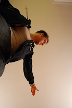
Our current photography project has a serious Cindy Sherman twist, with us having to recreate or explore genres / characters by creating 'fake film stills'. Can't say I was too thrilled with working on this project, mainly because A) I'm not big on Sherman-esque photos because they've been overdone, and B) it was required that I was in the photo which goes against my nature of not liking to be in my photos. So, the grinding is really just a matter of personal artistic vision, haha. I like narratives and setting scenes... Just don't expect me to be in them!
 11" x 16" Digital Print
 16" x 11" Digital Print
For my photos, I kinda amalgamated a couple genres into one, since I saw a lot of overlap. It's something of a combination of art-house and drama, looking at how the male is generally portrayed in these films as a passive, inward looking individual. Do I agree with this portrayal? Not really. But I do think it's interesting because it seems like a reversal of objectification, and I felt like playing with that. I kept the scenery bare in order to draw focus to the 'character' as well as create a minimalist motif. Also, I used a low-level noise filter to play up the art-house feel as well as make the images a little more punchy.
Here's hoping everybody likes my photos... I still need to make up a name for them. Preferably something non-emo.
Thursday, February 12, 2009
On Struggle...
These are documentation photos I took of my installation project I did for my 3rd Year drawing class. I had my critique yesterday, and I think it went pretty well, despite not being able to install in the room I had initially wanted.
 Angels detail, 2.5'x5'
 Demons detail, 2.5'x3'
 Perspective view of the space created by the projection
 View of how the projection was created
 View of the Angels with the Gates projected on them
 View of the Demons with the Gates projected through them
I was really interested in how nobody in my class responded to the religious subject matter, and only seemed to comment on the installation and the space itself. On the one hand, I had worried that the religious content would be somewhat over-powering so I was happy that nobody seemed to take issue with it, but on the other hand I was a little disappointed that nobody wanted to challenge me on it. I'm glad that the space was commented on, 'cause it means I'm doing something right!
Subscribe to:
Posts (Atom)